The Gantt chart is your planning assistant. What is a Gantt chart and how to create one? What is a Gantt chart?
How the Gantt chart is built and what it consists of
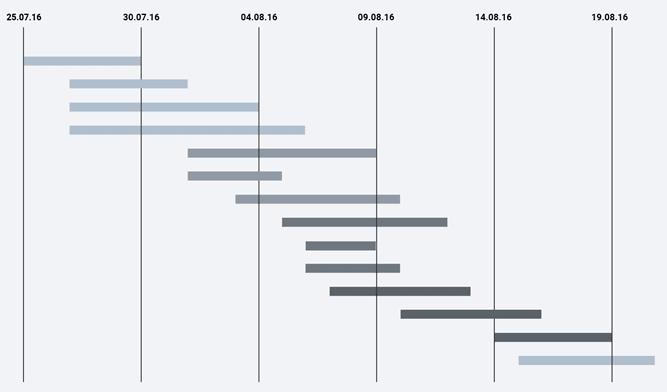
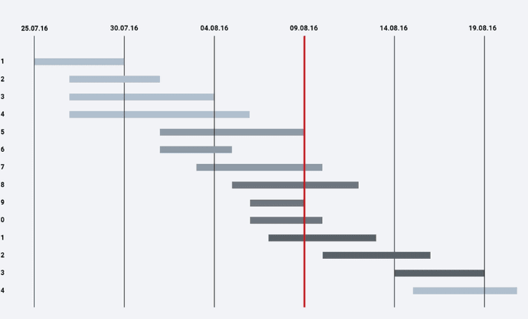
The chart consists of blocks located on two axes: the tasks that make up the project are located vertically, and the time scheduled for their execution serves as the horizontal axis of the Gantt chart.
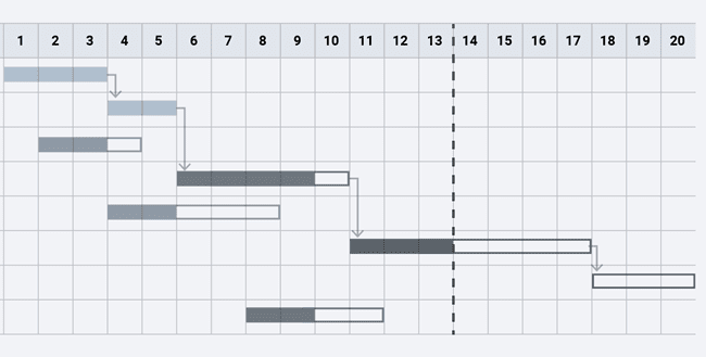
The beginning of the horizontal stripes is the time when the task starts to be executed, the end of the line, respectively, is the planned end time. Tasks can (but do not have to) be dependent on each other. In such cases, a relationship line is created between them, indicated by an arrow.
In the illustration above, you see how today is marked with a vertical line on the diagram: the border separating what has already been completed and what is still in the process. It can also be used to judge the degree of completion of tasks – by the color filling of the lines corresponding to them. Gantt charting tools allow you to label tasks in different colors by introducing visual coding of different categories, for example, highlighting red for programming and yellow for design.
Another important part of planning with this method is milestones. They mark the key moments of the project, showing the deadline for several tasks, which means the closure of an entire stage of the project.
One of the main properties of the Gantt chart that should not be forgotten is the planning tool. The diagram is flexible and the tasks in it are interrelated. So a shift in the timing of one can lead to a change in the execution time of the others and an increase (or decrease) in the implementation time of the entire project.
What is a Gantt chart?
The Gantt chart is probably the most popular tool for any project manager, namely, a way of presenting the project schedule in the form of a horizontal bar chart, where tasks are located along the vertical axis and dates are located along the horizontal axis.
In English, the Gantt chart is called similarly, Gantt Chart, much less often you can find the concept of “strip chart”, but they are all the same.
The Gantt Chart is named after its creator. Henry Lawrence Gantt lived in the second half of the 19th century, studied management, dealt with human factors in production, etc., and in 1910 proposed a new and at that time revolutionary way of presenting work schedules.
Nothing more sane and visual for visualization and planning of the sequence of work over the next 100 years has not been invented, although now sometimes you can see articles on Facebook on the topic “Gantt chart is no longer fashionable, agile will save us all”. At such moments, you want to make a facepalm and say “get out of the profession, it's like confusing warm and yellow.” But there are unique people, and without them it would be boring.
Essence and characteristics
The planning of project activities is characterized by regular refinements, adjustments of plans and their constant updating not only at the stage of developing the schedule, but also in the process of implementation. The schedule of the work plan, presented in the form of a Gantt chart, provides an instrumental opportunity to better assess the resource composition and the relationship of work. Ultimately, this reduces the number of subsequent changes during the implementation of project activities. And the presentation form makes the assignment of tasks by time more visual. That's what a Gantt chart is for.
In PMI's definition, the concept of a schedule is the same as the concept of a project schedule. Such a schedule is created to calculate and show the total duration of a project as an expression of the timing of project activities. The sequence of links in the chain of the planning process, expressed in the schedule, correlates with the hierarchical structure of work, the involvement of material, financial and human resources. The depth of task decomposition largely depends on the ability to quickly find employees, materials and budget funds to complete such a task. Control over the content, timing and sequence of work is carried out using a coordinating schedule. The Gantt chart shows the schedule of planned activities for the project task, but the Gantt chart does not show the significance, resource intensity and scope of the work.
There are the following types of links between tasks:
- Independent start of work.
- The beginning is the beginning. Operation No. 2 begins no earlier than Operation No. 1.
- The beginning is the end. Operation # 2 cannot be completed until operation # 1 begins.
- The end is the end. Operation No. 2 should be completed not earlier than operation No. 1.
- The end is the beginning. Operation # 2 does not start until the completion of operation # 1.
The links between tasks – the sequence indicator and work dependencies – are depicted in the diagram as curly arrows. In addition to the designation of links, the histogram may have additional informational marks:
- about aggregate tasks,
- the percentage of completion of the task,
- the label of the current moment (a vertical bar measuring “Today” on the calendar scale),
- marks of milestones (key points).
A milestone is here called the mark of a significant moment that occurs in the course of work, the common border of several tasks. The presence of milestones determines the need for consistency and synchronization. A milestone is not a calendar date, but its shift leads to a shift in the timing of the entire project. Large projects informationally and illustratively overload the Gantt chart, which is considered one of the main limitations in its use. But, in addition, the lack of flexibility in reflecting constantly changing projects, and the inability to present several planning options on one schedule are considered a limitation.
Nevertheless, having appeared in the early 20th century, the Gantt chart is still included in the practice of managing small and medium-sized projects as an important illustrative planning tool.
What is a Gantt chart used for?
Gantt charts help project managers and product managers break projects down into work tasks for easy management, maintain order, and visualize task dependencies.
Instructions: how to build a Gantt chart in 5 steps?
Next, we will consider the rules for constructing a Gantt chart and try to create it ourselves in a Microsoft Excel spreadsheet processor.
Convert bar chart to Gantt chart in Excel
We now have a pivot bar chart. We need to add the correct formatting to make this chart look more like a Gantt chart. Our goal is to remove the blue bars so that only the orange parts that represent the project tasks are displayed. From a technical point of view, we will not remove the blue stripes, but simply make them transparent and therefore invisible.
- Click on any blue bar in the Gantt chart to select them all; right-click and select Format Data Series from the context menu.
Spatial (three-dimensional) diagrams
Spatial or three-dimensional charts are volumetric analogs of the five main types of two-dimensional charts: line charts, area charts, histograms (bar and line), and pie charts. The 3D image makes the information easier to understand. These diagrams look more convincing.
History of origin
According to the main version, the graph was conceived by the American engineer Henry L. Gantt (the spelling Gantt is often found, which is closer to the original). In 1910, the first version of the diagram appeared, applied later at a shipyard, where Gant applied a graph that allows you to effectively manage the activities of several engineers in solving time-limited problems. Initial template:
- included a listing of all tasks for the project,
- assigned personal responsibility for the completion of the task,
- determined the period required for the completion of his part of the activity by the performer,
- displayed the dependence of one task on another.
The reward system was tied to the fact of achieving the set goals. Since Gant believed that the enterprise, as part of its responsibility to society, should be responsible for their use of human and other resources, a bonus was rewarded for managers who were able to teach staff well how to use methods to increase labor productivity.
The diagram was quickly adopted “into service” in other industries and was used in the planning of civil engineering structures (for example, during the construction of the Hoover Dam, which began in 1931, the expressway system in 1956). It was not until almost 80 years later that the original graphical example was changed. In the 90s, communication lines were used to clarify the complex relationships between tasks.
However, according to one of the alternative, but reliable versions, for the first time a familiar example of a diagram was proposed back in 1896 by the Polish economist, engineer and researcher of management theory Karol Adamiecki.
The Polish author has invented a method of displaying links between processes to increase the visibility of the production schedule. Several articles on this topic were published by him in a Polish journal back in 1909 and were not translated into English (although the theory was widely known in Russia since 1903). It was only in 1931 that an article was published describing in more detail the chart that Adametsky called harmonogram (variant: harmonograf), and which was very similar to the Gantt chart. However, by that time, the chart had already gained fame and distribution in the English-speaking world as a Gantt chart, so the invention retained the name of the American scientist.
Types of charts in MS Excel
Microsoft Excel supports various types of charts to help you present your data in a way that is understandable to your audience.
Histograms
You can display data in columns or rows in a worksheet as a bar chart. Bar charts are useful for showing changes in data over time and for visually comparing different quantities. In bar charts, categories are usually plotted along the horizontal axis and values along the vertical axis.
Charts
Data located in columns or rows of a worksheet can be presented in the form of a graph. Graphs show continuous data changes over time at a consistent scale and are ideal for presenting data trends at regular intervals.
In graphs, category data is evenly distributed along the horizontal axis, and all values are evenly distributed along the vertical axis.
Graphs can be used when category labels are text and represent values equally spaced, such as months, quarters, or fiscal years. This is especially important when you have multiple series: you can use a scatter plot to display a single series. Also, graphs can be used if there are several numerical labels separated by equal intervals, in particular, years. If there are more than ten numeric labels, it is better to use a scatter plot instead of a graph.
Pie charts
Data in a single column or row of a worksheet can be represented as a pie chart. A pie chart shows the size of the elements of one data series relative to the sum of the elements. Data points in a pie chart are plotted as percentages of the entire circle.
Bar charts
You can display the data in the columns or rows of the worksheet as a bar chart. Bar charts are used to compare individual items.
Area charts
Data in columns or rows of a worksheet can be represented as an area chart. Area charts highlight the magnitude of change over time and can be used to draw attention to the total value according to a trend. For example, data showing profit over time can be plotted in an area chart to draw attention to overall profit.
Scatter charts
The data in the columns and rows of the worksheet can be represented as a scatter chart. A scatter plot shows the relationship between numerical values in multiple data series, or displays two groups of numbers as one row of x and y coordinates.
A scatter chart has two value axes, with some numeric values plotted along the horizontal axis (X-axis) and others along the vertical axis (Y-axis). In a scatter plot, these values are combined into a single point and plotted at irregular intervals or clusters.
Scatter charts are commonly used to illustrate and compare numerical values, such as scientific, statistical, or technical data.
Stock charts
Data arranged in columns or rows of a sheet in a certain order can be represented in the form of a stock chart.
As the name suggests, stock charts are most often used to illustrate changes in stock prices.
However, they can also be used to output scientific data.
For example, you can use a stock chart to represent daily or yearly temperature fluctuations.
Surface charts
The data in the columns or rows of the worksheet can be represented as a surface chart.
A surface chart is useful when you need to find the optimal combinations of data from two sets.
As in a topographic map, areas belonging to the same ranges are highlighted with colors and shading.
Surface charts can be used to illustrate categories and datasets that represent numeric values.
Donut charts
Data located only in columns or rows of a worksheet can be represented as a donut chart. Like a pie chart, a donut chart shows the relationship of parts to a whole, but it can contain more than one series of data.
Bubble charts
In a bubble chart, you can display data in worksheet columns by pulling the x-axis from the first column of data, and pulling the corresponding y-values and bubble sizes from adjacent columns.
Concepts with the word “chart”
-
A diagram (Greek Διάγραμμα (diagramma) – image, drawing, drawing) is a graphical representation of data with linear segments or geometric shapes, which allows you to quickly assess the ratio of several quantities. It is a geometric symbolic image of information using various visualization techniques.
-
In category theory, a diagram is a categorical analogue of an indexed set in set theory. The main difference is that there are morphisms in the category that also need to be indexed.
-
Directional Pattern (Antenna) – A graphical representation of the relationship between antenna gain or antenna gain versus antenna direction in a given plane. Also, the term “radiation pattern” is applicable to other devices that emit a signal of different nature, such as acoustic systems.
-
A bar chart or bar chart is a chart represented by rectangular zones (bars), the heights or lengths of which are proportional to the values they display. Rectangular zones can be arranged vertically or horizontally.
-
A class diagram (English Static Structure diagram) is a structural diagram of the UML modeling language, demonstrating the general structure of the hierarchy of classes of the system, their cooperation, attributes (fields), methods, interfaces and relationships between them. It is widely used not only for documentation and visualization, but also for design through forward or reverse engineering.
-
(all concepts)
Other charts
The phase diagram is used to determine the values of the relationship between pressure and temperature conditions of a substance and the phase in which it is located (solid, liquid or gaseous). An example is a carbon iron diagram.
The activity diagram represents the processing flows for monitoring activity. This diagram is used to track the stages of the computational process. The activity diagram was drawn using the Unified Modeling Language (UML).
Collocation of the word “diagram”
- pie chart
bubble charts
following chart - directional pattern
- in the form of a diagram
- diagram shows
- draw diagrams
look at the diagram
build diagrams - (complete compatibility table)
Sources used and useful links on the topic: https://skillbox.ru/media/management/kak_postroit_diagrammu_ganta/ https://upravlenie-proektami.ru/vse-pro-diagrammu-ganta https://finswin.com/projects/instrumenty /diagramma-ganta.html https://www.atlassian.com/ru/agile/project-management/gantt-chart https://FB.ru/article/142650/diagramma-ganta—vash-pomoschnik-v-planirovanii -chto-takoe-diagramma-ganta-i-kak-ee-sostavit https://naprimerax.org/diagramma-ganta-v-excel https://izotop.jimdofree.com/%D1%80%D0%B0% D0% B7% D0% B4% D0% B5% D0% BB% D1% 8B-% D0% B8% D0% BA% D1% 82 /% D0% B3% D1% 80% D0% B0% D1% 84% D0% B8% D0% BA% D0% B8-% D0% B8-% D0% B4% D0% B8% D0% B0% D0% B3% D1% 80% D0% B0% D0% BC% D0% BC% D1% 8B /% D0% B4% D0% B8% D0% B0% D0% B3% D1% 80% D0% B0% D0% BC% D0% BC% D1% 8B / https://kartaslov.ru/%D0%B7%D0%BD%D0%B0%D1%87%D0%B5%D0%BD%D0%B8%D0%B5-%D1%81%D0%BB% D0% BE% D0% B2% D0% B0 /% D0% B4% D0% B8% D0% B0% D0% B3% D1% 80% D0% B0% D0% BC% D0% BC% D0% B0 https: //ru.basicdefinitions.org/219-diagram
Post source: lastici.ru