Logo Maker Apps: An Overview of Free Services. Best logo maker software
What is a business logo for?
A logo is a symbol that represents your brand and its personality in the simplest possible way.
Logos embody your brand in the minds of your customers.
Without this, they have nothing to cling to. That's why:
People learn from visual cues: If there is something about your brand that you want your customers to remember, science claims that images are more effective than words.
Logos allow you to create branded merchandise: “branded merchandise” can be handed out at exhibitions, given as a gift to potential customers, and even sold in a store. Even a good conversation is forgotten much faster than a branded pen that a client finds at the bottom of his bag.
Logos provide a visual basis for graphic design: brand consistency is a key element in creating a lasting impression. Having a clear understanding of your brand at the most basic level will give you something to look out for when developing other marketing elements.
Logos help you stand out from the competition: certain symbols or icons are associated with certain industries. Think about how many health care businesses use red cross variations in their logos. When there are many businesses competing for the same market, distinguishing yourself is the key to getting noticed and remembered.
There are many benefits to a logo, so it's not hard to see why almost every business has one.
Entrepreneurship without a logo looks unprofessional.
It seems illegal, even unreliable.
Considering all of the above, I will show you step by step how to create your own logo using the example of our own brand “Ogonyok” – for clarity of the whole process.
How to create a logo from scratch: a step-by-step guide
Whether you want to create a logo yourself, hire a designer, or use an online service to create a logo, the process will consist of 7 steps:
- Understand why your brand is unique
- Find design inspiration
- Choose colors that reflect your brand
- Choose the right font
- Create multiple options
- Choose the best
- Polish up your final design
1 Think about your brand
Brand Identity is a catch-all term for your company's visual elements, from the colors of your branding to your logo and design elements of your identity.
These visual elements work together to make your organization stand out in the minds of your customers.
Before you start making the first designs for your logo, you need to have an understanding of your brand identity.
Start by asking yourself the following questions:
– Why did you start your business?
– What values are important to you as a company?
– What makes you different from your competitors?
Your brand identity is most important to you.
They will be the most recognizable for your customers, and they are the ones who will answer these questions.
Before you put your pen on paper, before choosing a color and aesthetics, ask yourself who you are.
Don't worry if you can't answer these questions right away.
This is a point of no return that needs to be pondered.
But once you think about it, you have more ideas for creating a logo that sets you apart from others.
To better understand this process, right now, together with you, I will develop a logo for Ogonyok, our fictional children's camp, which is based right in the forest and specializes in living in nature, right in tents.
I started by creating a mindmap of my brand values.
Mind Mapping is a visual brainstorming technique.
You start with a central idea (in this case, your brand) and build your thoughts by connecting keywords and related concepts around that central idea.
Mind Mapping can be done alone or in a group and is a great tool for reorienting your ideas or creating new ones.
In brand development, this is ideal for building consensus on a consistent brand identity.
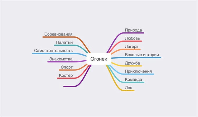
Mind Mapping is a great technique for developing a holistic brand.
Using my mindmap, I was able to develop a conceptually strong brand so that it would be easier to answer questions that would help me understand what sets the brand apart from its competitors:
Why did I start my business?
I founded my children's camp because I wanted to teach children to really be friends with each other, to make new acquaintances easily, to work in a team and to give them an unforgettable experience for a lifetime.
Yes, before me, dozens of children's camps had already been opened in our country, but they all looked like boarding houses for treatment or some kind of sea hotels.
I wanted the children to learn independence and get healthier during the camp, so I decided to found a camp right in the forest.
What values are important to us as a company?
At Ogonek we value friendship, sport and the spirit of adventure.
Getting into the society of children who are similar in age, but at the same time not familiar to the child, he learns to quickly make acquaintances and learns to be friends.
Due to living outside the buildings, there is an opportunity for a large number of unusual games, competitions and activities.
What makes us different from the competition?
Living in the forest for several weeks teaches children to be independent, to expend a lot of energy during the day and thereby helps to strengthen the immune system through physical activity in the fresh air.
By sending your child to our camp, you can be sure that in a few weeks he will progress in several directions at once: health, networking, sports, ingenuity and independence.

What truly distinguishes Ogonyok is love for children.
Our team of counselors is dedicated to creating education and supporting children in such an important transitional age.
The founder of the camp also works as a counselor, since Ogonyok is not a business, it is a vocation to which every employee is fully committed.
Considering our corporate identity, our creative ideas have evolved more and more.
The camp didn't have a logo design yet, but we were able to figure out what values are needed for our design.
Which program to choose for creating logos?
Many logos look simple enough, but your creative ideas can be overwhelmed if you don't find the right software for the job.
Each designer has their own workflow. But many people prefer to first make sketches on paper, scan them and only then draw on a computer. By creating a logo in a vector, you make it more flexible for work, editing and transformation – and thus, satisfy the needs of the client. Let's take a look at the most popular vector programs:
Verdict?
There are two stages in the process of creating a logo design.
First, you need to get inspired and create a sketch, and here it all depends on your personal preferences – whether you prefer to draw the logo by hand, or do the tracing on the computer (Illustrator is the best tool for this), or you will rather create a font logo from scratch and refine it with various font effects (InDesign will help you with this).
At the final stage, it is very important to decide on a program to work with. At this stage, you need to create the final version of the logo, completely ready for use. No client wants to get a merged JPEG file; he needs to have an editable, transformable vector logo. With this in mind, we go back to vector programs, Illustrator or CorelDRAW to finish and export our logo.
And as long as you can convert your sketch into a finished vector logo, it doesn't matter which way you do it. If you need a little inspiration, there is a huge collection of logos on Envato Market
Logo formats
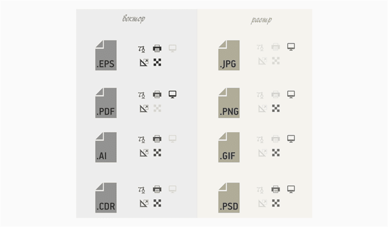
The logo, like any other picture, can be saved in various formats. Further details about each of them.
PDF (Portable Document Format)
This format in its original version displays fonts and images of various types. Also, this type of file is easy to print.
EPS (Encapsulated PostScript)

Used to obtain the highest possible logo quality. In this format, the image can be scaled while maintaining sharp edges.
PNG (Portable Network Graphics)
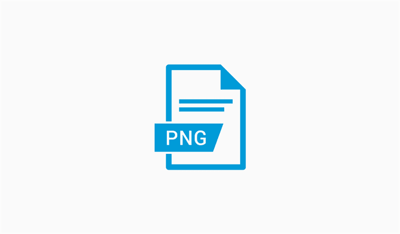
This bitmap format “compresses” the logo without spoiling its quality. Files of this kind can be opened with any image viewing program.
JPG и JPEG (Joint Photographic Experts Group)
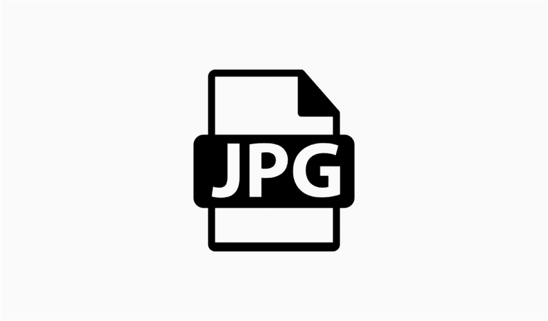
A logo saved in this format is lightweight and loads quickly. In addition, the logo is of the same quality as a vector graphic.
TIFF (Tagged Image File Format)
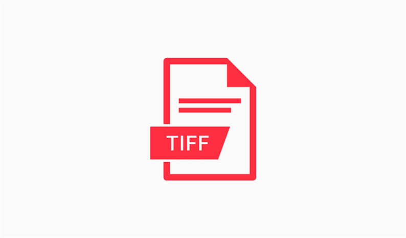
It is very similar to JPG and JPEG, however the files of this format weigh much more. This is because the pictures are of a higher quality.
Analysis and strategy development
Before picking up a pencil, you need to conduct a thorough market analysis. Here are five tips to help you avoid mistakes in this important first step.
01 Find out who your competitors are
In the 80s of the last century, the emergence of Apple heralded a real revolution in the computer industry. Apple is now one of the leading brands in the world. Before you start crafting your logo concept, take the time to research your target market.
Explore and compare competing company logos. Through this research, you can discover trends and traditions that are characteristic of branding in this market – typical colors, fonts, approaches to visuals. This will help you play on visual associations that the audience is already familiar with.
However, remember that the most recognizable logos in the world have become so precisely because their authors refused to follow trends and chose to go their own way.
02 Ask the right questions
The role of strategy in the brand building process is constantly increasing. Regardless of the size of your project, developing a strategy always starts with asking the right questions.
In his latest book, Branding: In Five and a Half Steps, Michael Johnson discusses the creative process of the Johnson Banks design bureau, and goes into great detail on complex issues such as building a brand strategy.
According to Johnson, you should ask six questions about the brand you work for.
Here they are: Why are we here? What do we do and how do we do it? What makes us different from the competition? Who are we here for? What do we value the most? What is our personality?
03 Be flexible
Once you've developed your strategy, don't be afraid to tweak it. It is no coincidence that there is an additional half-step in the creative process. Step 2.5 is an intermediate step between strategy and design.
There can be two opposite scenarios for the development of events. On the one hand, some ideas that looked promising on paper are not viable in theory. Conversely, a non-standard visual solution that suddenly occurred to you during the design process can force you to adjust your strategy.
04 Respect the brand heritage
A successful example of a rebranding is the work of the North design studio, which managed to breathe new life into the old logo of the Co-op chain of stores. The work was honored with an award at the prestigious Brand Impact Awards. The studio has managed to revive in consumers the warm feelings that they once had for the company.
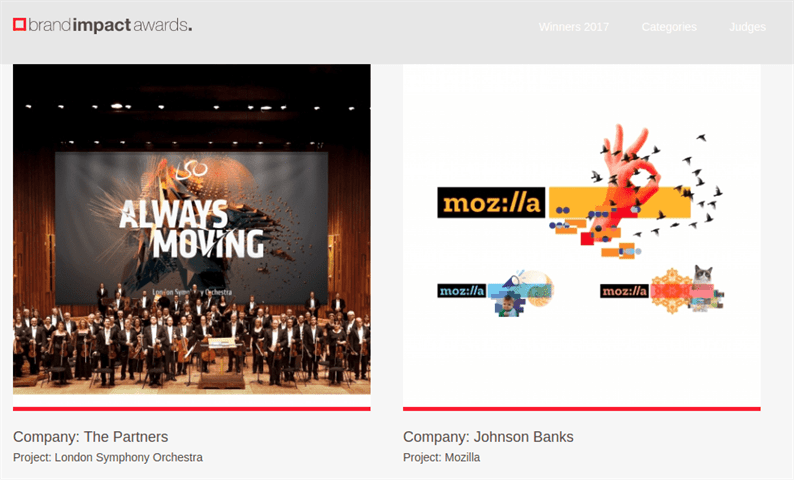
A few months later, NatWest and Kodak took advantage of this technique. While the retro trend should be treated with caution, if a logo contains valuable corporate heritage, it would be foolish to ignore it.
“You cannot be led by your ego. You need to be able to see variants of logos created by other designers before you. In making a revolution, you have to give evolution a credit. ” – writes North co-founder Stephen Gilmore in an essay in Computer Arts magazine
05 A logo is just one element
In this 2016 video, Brand Impact Awards jurors Bruce Duckworth and Mark Bonner talk about how the logo is only one small part of the branding process.
As Bonner puts it, the pyramid is now overturned. People interact with a brand through a myriad of touchpoints, and the logo isn't always the first of those touchpoints.

Keep this in mind when designing your icon. Try to create a versatile and flexible design. Pay attention to how the logo combines with other branding elements, from packaging to communicating with your target audience.
Choosing a font is a very important step. Most of the most recognizable brands in the world have text logos that interact with the audience primarily through type. Here are five tips to help you feel more confident among the huge variety of fonts and make the right choice.
06 Choose carefully
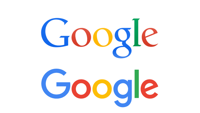
As part of a massive rebranding, Google ditched a font that had served it for 16 years. The online giant in 2015 opted for a more concise and modern sans-serif typeface.
In recent years, against the backdrop of the pursuit of minimalism, sans-serif fonts have become dominant in logo design. An example is the rebranding for Windows, MasterCard and the University of the Arts in London by Pentagram.
But don't let trends rule you: a serif typeface can be perfect for your project, especially if you want to create a stylish and luxurious or traditional and professional look. Take your time and carefully weigh the pros and cons.
07 Experiment with type
Thanks to a specially created font, the lettering on the logo from Company Folders seamlessly “blends” into the design of the motorcycle.
If you have made a choice in favor of an existing font (especially one as popular as, for example, Helvetica), then you will have to express the brand's personality through images, color palette, communication style, and so on.
When applying a standard font to a text logo, it is important to be able to work with tracking (text density) and kerning (spacing between character pairs). The low density of the text gives the logo a complex, authoritative look, and the close arrangement of the letters allows them to be combined into independent images.
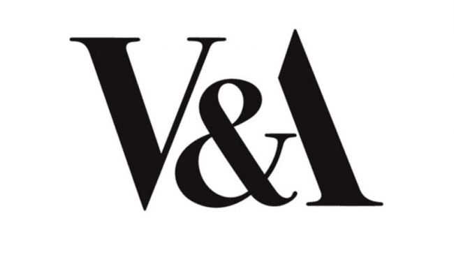
The V&A logo is a great example of how a simple-looking logo can become “immortal”. Designer Alan Fletcher skillfully played the fusion of the ampersand and the letter A.
By experimenting with your chosen font, you can smooth out the transitions between letters or add a unique detail that characterizes your brand. For example, you can trim the curves at the ends of letters at equal angles to give your brand a more expressive and professional look.
08 Consider using a unique handwritten font
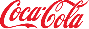
For more than a century, the Coca-Cola Company has made only a few minor changes to its iconic logo, proving that a handwritten typeface can stand the test of time.
Sometimes none of the standard fonts just work, and the handwritten font looks perfect. The most striking example of such a visual identity, which has gradually changed over a century, is the Coca-Cola logo.
Unlike its eternal rival Pepsi, which has seriously revised its visual identity at least 7 times, the Coca-Cola Company has hardly changed its logo since the end of the century before last. If Coca-Cola ditched its signature typeface in favor of an austere sans-serif typeface (as Pepsi did in the 1960s), there would be a storm of indignation.
By choosing a truly unique, personalized handwritten font, you will create a strong, recognizable brand that will remain relevant for years to come.
09 Experiment with random letter combinations
An example of a simple yet effective emblem is the Yves St Laurent brand logo, which resembles a dollar sign.
Monograms aren't just used on robes and wedding invitations. With the right approach, company initials can form a laconic yet interesting logo. Great examples are the emblems of two fashion houses – the intertwining C and S of Coco Chanel and the dollar sign in Yves Seine Laurent's initials.
The FedEx text logo from design bureau Landor regularly tops lists of the best logos of all time, thanks to a cleverly hidden arrow.
Sometimes, even in a simple typeface, you can find interesting “random” combinations that will give your logo a new interpretation. A classic example is the FedEx logo designed by the professionals at Landor. The arrow between the letters “e” and “x” instantly transforms an unremarkable text logo into a true masterpiece of design. Apply different fonts to your brand name, look for interesting details and combinations, and you might be in luck.
10 Use a unique font as the basis for your branding
The font for the itv logo, designed by Fontsmith studio, was chosen so well that the company decided to use it in all aspects of its branding in order to form a uniform corporate identity.
If your budget allows you, you can order from a professional design studio (such as Dalton Maag or Fontsmith) a whole family of fonts made especially for the company. This will make the font the centerpiece of the brand.
Many popular brands are easily identifiable even without a company name. And some brands have created a strong, almost subconscious association with a particular geometric shape. The following five tips will teach you how to skillfully correlate form and symbolism.
11 Back to Basics
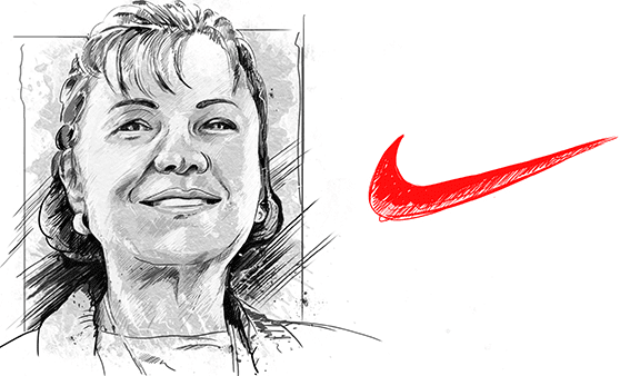
While still a student, Carole Davidson received just $ 35 for the now iconic Nike symbol. A surprisingly simple symbol that can be sketched with a few strokes of the pen, has become one of the most recognizable emblems in the world.
The first golden rule that all professional logo designers follow is simplicity.
Think well about the concept of your future logo, but don't overdo it. Don't overcomplicate your logo just for the sake of aesthetics. The logo should be easily recognizable and easily scalable. Consider whether it will look equally good in the footer of a website and on the facade of a building?
We recommend one effective method for you: remove elements from your logo until it is as minimalistic as possible. Will your logo still be recognizable if you sketch it out with a few quick strokes? What are its most characteristic features? In other words, the simpler the logo, the better.
12 Explore the psychology of figures
The yellow triangle, red square and blue circle have become visual symbols of the Bauhaus School of Design. In this print, titled Bauhaus Revisited, Marco Ugolini demonstrates that the psychology of shapes can be successfully applied to logo design.
However, there are several visual clichés that have already set the teeth on edge and will surely cause an ironic grin on the face of any professional designer. For example, ditch a lit light bulb as a symbol of new ideas or the globe as a symbol of international reach.
But the psychology of shapes and figures is not as simple as it might seem. The yellow triangle, red square and blue circle are often used as symbols of the highly respected Bauhaus School of Design. This combination of shapes was developed by Wassily Kandinsky, who believed that shape and color were able to overcome cultural and linguistic barriers.
According to Kandinsky, the bright, cheerful yellow color successfully complements the angular sharpness of the triangle; cool, soulful blue blends perfectly with the circle; and earthly, instinctive red is in perfect harmony with the square. We will return to the psychology of flowers later.
13 Work with coordinate system and structure
It is not uncommon for designers to draw the audience's attention to certain details of the geometric structure of the logo. A great example of this is the recent rebranding of Deliveroo, brought to life by the professionals at DesignStudio.
More and more design studios are putting their portfolios on the public display. Their best work can be seen on online platforms like Behance and Dribble, on their own websites, or in thematic publications.
The new Twitter icon is built around a set of intersecting circles, which, according to this drawing, correspond to 1: 1.618 (the so-called “golden ratio”).
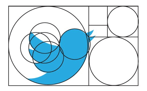
You can often see a description of the technical side of the logo composition. In other words, we consider the coordinate system in which the emblem is built, its individual bends and corners. It is a valuable resource for understanding how to use theoretical design principles (such as the golden ratio) in practice.
14 Engage negative space
Even the most primitive use of negative space can have amazing effects. For example, on the NBC emblem, with just one stroke, six multicolored drops turn into a peacock.
One of the best examples of the use of negative space in an all-text logo is the FedEx logo we mentioned earlier. However, there is also ample evidence among graphic logos that, if handled correctly, negative space can dramatically transform your logo.

Moreover, the skillful use of negative space can add additional meaning to the logo, proving once again that the simpler the logo, the easier it is to remember.
15 Add wit and humor
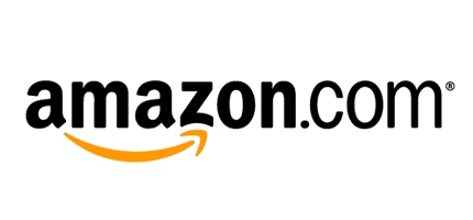
At first glance, the Amazon logo, owned by designer Turner Duckworth, may seem simple. However, the first impression is deceiving. The arrow not only symbolizes the smile of a satisfied customer, but also indicates a huge variety of products from A to Z (ie, from “A” to “Z”).
Negative space is just one way to hide interesting finds in the logo that will bring a smile on the face of a potential client. The great Alan Fletcher, one of the founders of Pentagram, was one of the first to use such techniques in graphic design. It should be noted that this practice pays off especially well in a design direction such as logo design.
If you want to spice up your work with a pinch of wit and charm, we recommend that you read the book on design A Smile In The Mind. The book was written by Beryl McAlhone and David Stuart and later edited and updated by Nick Asbury and Greg Quinton of The Partners branding agency. The book contains many inspiring examples from leading design experts, including Fletcher.
As Quinton and Asbury write in their introduction to the book, “Wit is the key to the success of giants like Google, Apple, and Coca-Cola … Wit is the magic potion that turns suitcases into adventure machines, and vacuum cleaners are home friends “.
The psychology of color plays a huge role in building strong associations with your brand. It is equally important for both graphic and text logos. Here are five tips to help you use your color palette wisely.
16 Get to know the color wheel
Color theory is based on the color wheel. This tool, invented by Isaac Newton back in 1666, allows you to create various color combinations. The standard circle is based on the RYB color model and has 12 colors.
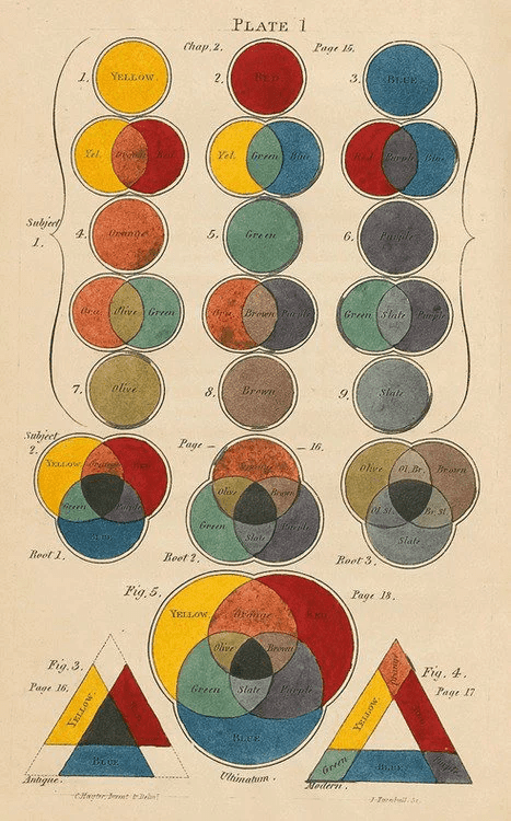
Primary colors are red, yellow and blue. Secondary colors (green, orange, and magenta) are a combination of two primary colors. Finally, tertiary colors are created by mixing primary and secondary colors.
There are other color schemes: with split complementary colors (uses two colors that are adjacent to the complementary color of the base color); rectangular (4-color scheme with two pairs of complementary colors); and square (4-color scheme with colors spaced at equal distances from each other).
17 Work with color schemes carefully
Some of the color schemes mentioned above should be handled very carefully. Usually, colors should not be used in the same amount.
Overdoing it with complementary colors can make the logo look overly vibrant. Analog circuits have a completely different problem: they are soft and pleasing to the eye, but lack contrast. In this case, you should choose the dominant color, and use the rest of the shades only as accompanying and accent colors.
Design Bureau Landor has received a fair amount of criticism for rebranding the logo for oil giant British Petroleum, because green shades are invariably associated with nature and care for the environment. Be that as it may, the company's new logo is a great example of the use of an analog color scheme.
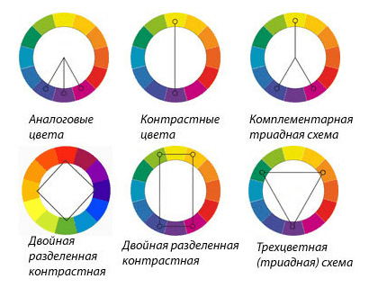
Triadic color schemes carry more saturation and energy, but you still need to choose one dominant out of three shades. For beginners, it's best not to risk it and opt for a split complementary color scheme that offers a natural balance of contrast and harmony.
A good example of a split complementary color scheme is the Firefox logo. Here, the dominant red color of the fox is balanced by the blue of the globe, and the yellow of the tail serves as an accent.
18 Use color to control your mood
In addition to BP, McDonalds also uses the analog color scheme. However, the restaurant chain favors the warm shades of the spectrum, evoking connotations of happiness and fun.
Your choice of colors can either take your logo to the next level or doom it to failure. This effect is due not only to aesthetic reasons, but also to psychological associations that can cause colors. We touched on this slightly when we considered the Bauhaus theory.
In short, the warm colors of the spectrum (such as red and yellow) are bold, cheerful and energetic, while the colder shades (blue and green) exude calm and restraint. These features are widely used in branding: companies turn to certain colors to evoke certain feelings in customers, as well as to stand out from the competition.
19 Study color trends in your industry
Sometimes color becomes the subject of legal dispute. For example, manufacturers Cadbury and Nestlé fought over the right to use a specific shade of purple.
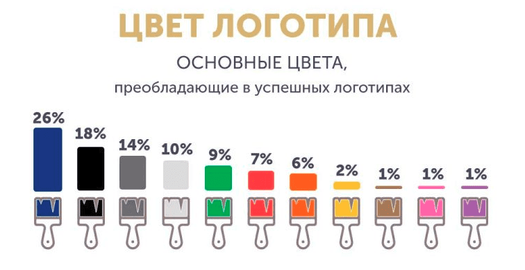
With its “own” color, a company gains a huge competitive advantage. Moreover, it guarantees instant recognition from potential buyers (sometimes even without showing the logo or mentioning the brand name).
Of course, choosing and skillfully using your “own” color is not an easy task. This requires not only the development of a decent logo, but also forward-thinking planning and implementation in relation to all elements of the brand and its advertising strategy. To achieve uniqueness, the company can secure one of the officially registered shades (for example, Cadbury 2685C in the catalog of the Pantone Color Institute). Another option is to deliberately choose a color that competitors avoid.
21 Awesome Examples of Using Color in Branding
If you want to stand out in the market due to the color palette, then first of all you need to determine which trends are dominating in this market now. For example, in the financial sector, blue is especially popular, but green can often be found on the emblems of environmental organizations. Sometimes it is worth abandoning proven trends in favor of non-standard color solutions.
20 Don't Forget the Black and White Palette
Designed by Italian graphic designer Francesco Saroglia, the Woolmark logo represents a triumph of monochrome design and is widely regarded as one of the finest emblems of all time.
With much talk about color, it's easy to forget that the most popular logos are actually monochrome. They successfully play on the powerful contrast contained in this palette.
But even if your logo is colorful, you need to make sure it looks good in black and white too.
If the colors in your logo serve to convey certain meanings, consider how you can convey those meanings in a black and white logo. Sometimes this requires changing the contrast of elements so that they continue to express meaning even in solid color reproduction.
21 Ask for the opinion of others
Don't underestimate what other people think about your logo, as a fresh eye can catch what you might have missed. As you conceptualize your logo, always double-check it for double meanings, hidden words and meanings, and the possibility of misinterpretation by members of other cultures.
Many design bureaus advise you to continually add your ideas to the board where your colleagues can see them. If you work in solitude, try to find designers who can appreciate your work. And, of course, you can always help them in kind.
22 Develop the whole world of the brand
As mentioned in tip # 5, a logo is just one small element of a branding strategy. Therefore, the design of the logo should be in harmony with other elements, not forgetting that the logo is part of the larger “brand world”.
This term is used when describing the branding process at the SomeOne design bureau. As co-founder of the bureau, Simon Manchipp, said in a video interview with Computer Arts (see above), it is much better to achieve consistency between different elements than just matching: “Compliance is like solitary confinement – the same every day. But consistency presupposes flexibility and thoughtfulness of actions “.
23 Think about how to bring your logo to life
Today, a static logo that is attached to a website page or in the corner of an envelope is often not enough. Think about how to bring the logo to life so that it can be used in interesting digital solutions. After all, virtual reality is rapidly changing the world we are used to, and new technical solutions are becoming more and more accessible. In recent years, branding agencies have been actively exploring the possibilities of generative design and user engagement. All this allows you to make logos more dynamic and add an element of unpredictability to them. Of course, this is not always possible, but in any case, you should remain open to new technologies. Consult with experts in animation and motion graphics.
24 Help your customers
Manuals 2 offers a glimpse into the fascinating world of corporate design guidelines. Design – Spin, publishing – Unit Editions.
Detailed guidelines for the use of corporate identity should cover all issues, including color choice, minimum and maximum logo sizes, positioning rules, spacing, and also what absolutely should not be done (for example, stretching or distorting an image).
While some agencies consider it their duty to provide such guidelines to the client team, others feel that such guidelines are overly restrictive and regulatory. Unit Editions has published two manuals (Manuals 1 and Manuals 2) with the best examples of corporate identity. These guides will become indispensable helpers in the branding world for you.
25 Be Prepared for Criticism
Similar to Airbnb last year, DesignStudio's rebranding of the English Premier League has sparked outrage from conservative football fans.
Over the past few years, social media has become an integral part of our lives, and now everyone (and even their dog) has their own opinion about design. If you are rebranding a relatively large and well-known project, you need to be prepared for criticism.
As we said before, a good branding strategy is much more than just a logo. But on social networks (for example, Twitter), a new project is often represented by only one image, which the audience pounces on.
Over the past few years, London-based design bureau DesignStudio has already faced several criticisms of its projects (first – Airbnb, then the Premier League). In the video above, the DesignStudio team explains how to deal with criticism on the web.
But the design bureau Johnson Banks decided to play on the growing interest in design and invited the public to participate in the creative process of rebranding the Mozilla browser. What conclusion can be drawn from this? Try to stay thick-skinned. Take good advice into service, and take the rest of the criticism as something inevitable.
Types of logos
There are a huge number of logos. But in general, they can be divided into four types – symbolic, text, combined, emblems and alphanumeric.
Symbolic logos
One of the most popular types of logo among companies. The logo is presented in the form of a symbol, often abstract. Its advantage is that it is easily perceived and perfectly helps to create images in the subconscious of a person, associations with a certain process or object.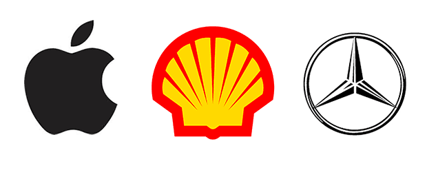
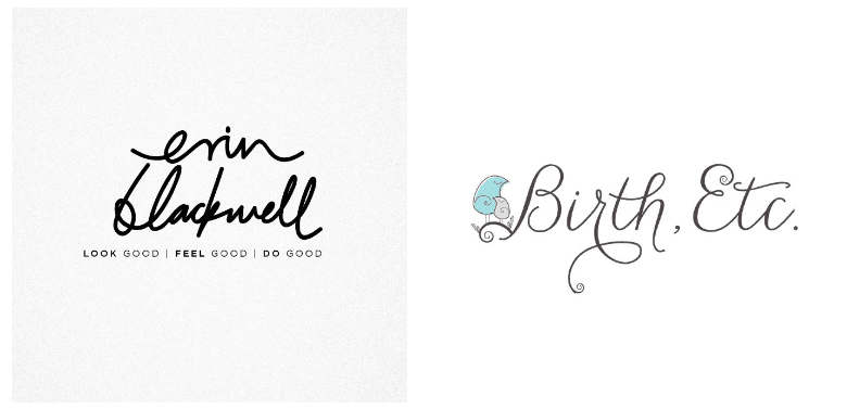
Text logos
The logo presented in the form of a stylized corporate font (letters). In addition, small graphic elements are often used: for example, a smile on the Amazon logo.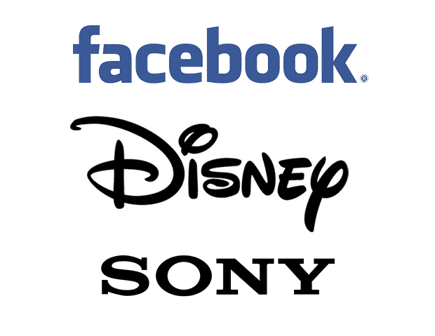 The advantage of this logo is that it is easy to remember and helps to stand out from competitors, especially if they use other types of fonts.
Verbal elements can be:
– existing words in the name of the company;
– artificial words;
– abbreviations;
– letters;
– numbers.
Combined logos
This logo uses both text and symbols. This look takes advantage of the two previous ones: the graphic element makes the logo memorable and helps to make the company name special and attractive.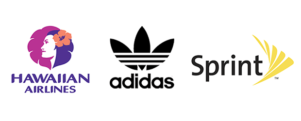
Emblem
Logos of this kind enclose a company name within a special art form. This is one of the most difficult types of logo.
Alphanumeric
A symbol is used that represents the name of the company using the initials or first letters of the name.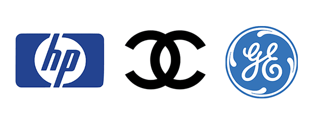 Many companies choose to use this type of logo because their initials better illustrate the company name than the full name (if it is too long or difficult to pronounce). These are the logos of such well-known companies as Hewlett-Packard, Chanel and General Electric.
Principles of logo creation
We already know a lot about logos. Therefore, you may get the impression that it is difficult to create a high-quality logo, since you need to know a lot of rules, fulfill all the requirements, etc. On the other hand, many say that there are no laws in the design, there have not been and will not be. By bringing these two groups of factors together, you may not want to follow certain principles and rules for creating a logo, since it is difficult and sometimes pointless to do this!
But, as in any creative work, in order to successfully break the rules, you need to learn them from the beginning. The chef does not take the ingredients from his head, but adapts a proven recipe and only in this way creates a signature dish. The development of a logo is done in a similar way. The basic principles and rules for creating a logo are the ingredients of our recipe, so let's take a closer look at each of them.
Simplicity
A simple logo is better perceived and remembered. In addition, it is highly readable and recognizable even at a very small size.
Simple logos are easy to recognize: they are memorable and most effective in communicating customer requirements. A simple logo grabs the viewer's attention even when driving 70 miles per hour, or on product packaging on crowded store shelves. Remember that the foundation for the international brand of the world's largest footwear and sportswear manufacturer (i.e. Nike) is a simple checkmark symbol.
– Jeff Fisher.
How to make a logo simple? Use as few details, colors and fonts as possible.
 The Chase logo is a great example of the simplicity of an icon and font.
Memorability
An effective logo needs to be memorable, and this is achieved through simplicity. This principle plays the most important role in a logo.
A memorable logo should contain elements that are immediately striking or associated with something familiar, something that is easy to remember.
 The Nike logo is a good example of a catchy logo. The logo was created in 1971 by Carolyn Davidson, a student at Portland University for $ 30
Durability
A logo must stand the test of time, have a foundation for the future.
 The CocaCola logo has not changed since 1885.
The correct logo remains relevant and effective after 10, 20, 50+ years.
Leave trends for the fashion industry. Trends come and go. When you're talking about changing a pair of jeans, or buying a new dress, that's okay, but when it comes to brand identity, durability is key. Don't follow the crowd. Stand out.
– David Airy.
Versatility
A logo should look great in a variety of environments (on company letterhead, in ads, on a website, in apps, etc.) and in different sizes. For this reason, a logo should be designed in vector format to ensure that it can be scaled to any size without loss of quality.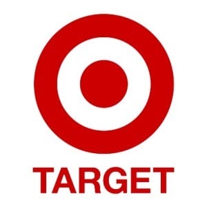
The Target logo is a great example of a versatile logo.
How to check the versatility of a logo?
Ask yourself if a logo would be great if it:
Printed in one color?
Printed in postage stamp size?
Printed like a big billboard?
Printed in black and white?
If the answer is “yes” to all the questions, congratulations! You've created a universal logo!
I like to work in black and white from the beginning to make sure the logo looks good in its simplest form. Color is very subjective and emotional. This can detract from the overall design.
– Patrick Winfield.
Compliance with the scope of the company
The logo must correspond to the scope of the company.
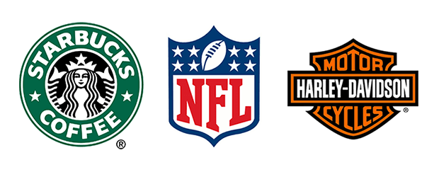
For example, if you are designing a logo for a toy store, it would be wise to use a “fun” font and icons associated with toys, children, etc. On the other hand, a logo doesn't have to literally represent what the company does. For example, the BMW logo is not a car at all, and the Hawaiian Airlines logo is not an airplane.
The question arises – should a logo correspond to the business sphere? The answer can be found in a recent study of one online logo maker.
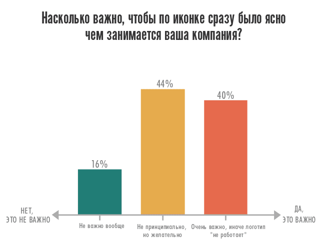 Entrepreneurs were asked: how important is it that it is immediately clear from the icon what your company is doing?
As you can see, 44% of entrepreneurs are in favor of the logo's relevance to the business sector. But whether the logo should fit your industry is up to you.
Compliance with the characteristics of the company
When you design a logo, you must consider the specifics of your company and the industry in general.
For example, a bank logo can be associated with reliability, stability, confidence. Accordingly, appropriate fonts and colors should be used.
 ](https://inform.com.de/wp-content/uploads/2021/04/post-69783-607acc6059d1a.png)[
](https://inform.com.de/wp-content/uploads/2021/04/post-69783-607acc6059d1a.png)[
Examples of logos that fit the business of the company
Uniqueness
On the one hand, the logo should correspond to the peculiarities of your industry, but on the other, it should be unique and not repeat other people's ideas. Therefore, when creating a logo, you must make sure that you are not copying another company's logo.
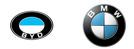
Chinese brand BYD, whose logo suspiciously resembles that of the German car giant BMW.
Do it yourself
Inspired by our recommendations and in a hurry to get creative on your own? You can follow one of several paths.
- The service for creating a logo can be integrated into a website or landing page builder. For example, we recently launched a logo maker at Flexby. It's available without a subscription, so experiment for free and make lots of different logos to try. The constructor has a large collection of fonts, images and a convenient editor – you can put our tips into practice right now.
- A simple but controversial option is logo stocks (Freepick, iStock, LogoMogo ). These are sites that have thousands of logos for any area of business. In most cases, logos need to be purchased, but there are also free ones. You will have to say goodbye to a unique style, but if you find the perfect solution for you, why not.
- Shareware online services for creating logos (Logaster, DesignMantic, OnlineLogoMaker ). Why conditionally? Most let you make a logo for free, but you will be asked to pay a small fee to download it. Sometimes only a vector format is offered for a paid download, which is needed for printed products (business cards, brochures, etc.)
- If you want to learn the basics of design skills, special software that is installed on your computer will help you: Adobe Photoshop (free analogues – GIMP, Krita, Paint.NET, Picnik), Adobe Illustrator, CorelDRAW (free analogues – Inkscape, Gravit, OpenOffice.org Draw). If you really want to, you can easily figure them out with the help of video tutorials on YouTube.
Please note that the worst option is to download your favorite picture by request “logos” from a search engine and change the name of the company to your own. If the original logo is registered as a trademark, you can be held administratively liable and fined.
Get inspired
Before creating your logo, it is worth looking at examples of famous brands. How are the values and business philosophy reflected in them? What message did the designers want to convey and what tools did they use for this? How did the logo change over time, how did you react to market changes?
Take a look around
Coming down from the heights of design thought, look at the competitors in your niche. How are you different from people playing on the same field with you, and how can this uniqueness be conveyed visually?
It is interesting how the differences in market positioning were embodied in the logos of the two sports giants. Compare the swoosh – the swash in the Nike logo, which symbolizes the swift flapping of the wing of the goddess Nike – and the three horizontal lines in the Adidas trefoil – stepping stones to the top of business:
Nike's energy and speed versus the solidity of Adidas
Formulate an idea
The logo should reflect the core values of your business. There are several ways to formulate them.
- Remember why you started your business, what you aspired to at the beginning of the path.
- If today you set yourself more ambitious goals, take them as a basis.
- Try to describe in one or two sentences what you are doing right now and for what or who you are doing it.
Inspirational example from a Yaroslavl clothing store: “We bring together the brands of Russian designers under one roof. We follow the current of slow fashion and conscious attitude to clothes. We value natural fabrics and quality. ” See how several ideas are reflected in one simple logo at once:
Pick up associations
After the idea is formulated, select associations for it. Answer the question: what thoughts and feelings should your logo evoke in the target audience? For visualization, choose a method convenient for you: write in a notebook, draw on a whiteboard, type on a computer, use a mind-map (“smart maps” that can be done using Coogle, XMind, FreeMind, etc.) Try to get away from the hackneyed associations with your line of business. It is unlikely that potential clients will single out the 45th construction company with the house logo among the competitors.
Decide on the type of logo
All logos can be divided into seven groups.
With a minimum budget, we advise you to focus on the text or combined type – the risks are lower, it is easier to make. Moreover, over the past few years, such logos have firmly established themselves among design trends.
Choose fonts and colors
If your logo will include text, first decide on the type of font.
It is not necessary to order a designer to develop a font specifically for your company, you can use free downloadable fonts (use the collections FontFabric, FontsOnline, AllFonts ). Another useful resource is Wordmark.it, it will show you how the word or phrase you entered will look like written in all the fonts available on your computer.
When choosing a font for your logo, keep a few tips in mind:
- If you hesitate between options, choose the one that is simpler.
- Consider which typeface suits your business (for example, a handwritten typeface would fit into a coffee shop logo, and a serif typeface would work for a copywriter).
- Be careful with intricate styles: they don't look good in miniature.
- Use no more than two fonts.
If you opt for a font logo, it will need to be placed on the site in the form of an image, because the user's browser may display it incorrectly.
So that the logo does not look like a “greeting from the 90s”, when choosing a color and style, be guided by the design trends of recent years:
-
clean, bright colors;
-
gradients and color transitions;
-
overlap;
-
imitation of the effect of a brush stroke;
-
negative images.
If you're not good at color combinations, try Color Calculator, an online service that minimizes logo color errors. There is a time and a desire to dive into the theoretical aspects of color combinations – enjoy.
Let's not waste time on “decoding” the meaning of each color from the point of view of its perception by conventional consumers – you can easily find articles on the topic of color psychology. But we advise you not to take this information as rigid rules.
Think about the shape
When choosing a logo shape, pay attention to simple geometry – circles, triangles, rhombuses, squares.
Recently, logos in the form of seals and emblems have been popular. For example, seals are often used by craft shops, law firms, etc.
Interior items workshop logo
“Slots”, stencil fonts look interesting.
The main advice on logo style is to strive for simplicity, it is not for nothing that this is a trend in the design of recent years. Remember that a simple logo is easy to remember and recognize.
Which icon should you choose for your logo?
Icons are great tools to grab the attention of your audience. They play an important role in understanding the message of the company. An icon, when chosen correctly, can make a logo more memorable and harmonious.
Relevance
Try to use an icon that helps connect the logo and your industry. For example, icons with animals may be suitable for a veterinary clinic, but for an airline the elements of an airplane: a wing, a pixel tail, an airplane as a whole. There are also hints of flight in the form of wings, air currents, birds. If the niche is neutral and does not imply specific elements, you can use abstract images.
Simplicity and conciseness
Try to avoid icons that are overloaded with elements. Choose simple, drawn in a few strokes. Thus, the icon will complement and not overload the logo.
Laconic colors
Don't use too many colors for your icons. Try to limit yourself to one or two colors.
Companies are becoming more active on Instagram. Therefore, it is imperative to stand out and incorporate this network into your overall marketing strategy. Acquired by Facebook, the application continues to improve: the discovery of ads, the display of content according to the algorithm, the emergence of analysis tools, etc. You gradually immerse your brand in the daily life of your subscribers, reaching them through the most direct channel possible. It fosters a good emotional connection and ultimately allows you to bring together a community of fans who are truly interested in your content or product.
Functionality
The icon should be functional and look good for use in product prints and outdoor advertisements. If it is too complex and multi-component, it will lose the quality and integrity of the logo when scaling.
How to choose a font?
The right typeface can highlight the strengths of your logo (and your brand), while the wrong typeface can create unpleasant associations and customer distrust.
When choosing a font, you should pay most attention to two points:
Readability
The font should be selected so that the text is clearly visible, it does not merge and does not blur due to an unsuccessfully chosen font. Also, the text should be legible even when resizing the logo.
Harmony
The font should be in harmony with the icon. If the icon consists of thin lines, you should not make it bold, it will look disproportionate. The situation is similar with the style of the icon, if the image is graphic, choose a font in the same style.
How to match colors?
Choosing a color for a logo is very important as colors have different associations and meanings. It is the color that evokes emotions and feelings in customers, so it is important to choose a color that suits your business.
General recommendations to guide you when choosing a color palette:
There is no specific color for any particular business sector, but some may be better suited to specific business niches.
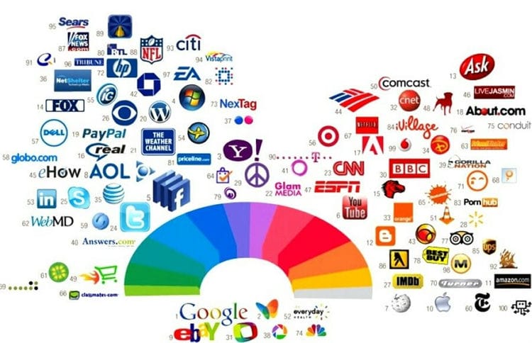
Colors can be combined. Some brands like eBay, Google, NBC, Instagram prefer to use a variety of colors. But with a combination of a large number of colors, be careful. This is appropriate when it comes to elements such as rainbow, butterfly, etc. Also, when designing a pure text logo, it avoids blotting colors.
Different interpretations of colors are inherent in different cultures. For example, in the west, white symbolizes purity and peace, but in China, white is death. Therefore, if you plan to enter different markets, make sure that your brand colors will be correctly perceived in all cultures.
How to make a logo in Photoshop
A well-known graphic editor allows you to quickly create a good logo. However, the result depends solely on the imagination and diligence of the designer. It will take a long time for beginners to understand the nuances of the program.
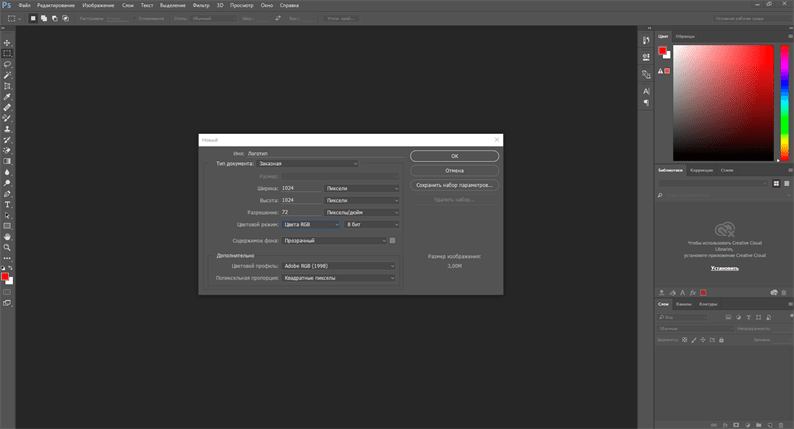
You can create a company logo in Photoshop as follows:
- Run the program and create a new file. If you still do not know in what size you need a logo, then specify a resolution of at least 500 pixels. You also need to choose a background for the logo. Initially, it is better to create a logo with a transparent background (it will look harmonious everywhere). But if you need a colored background, then you can specify it without any problems. The best option is to make a logo with a transparent background (for a website, for example) and a colored one (for social networks, for example).
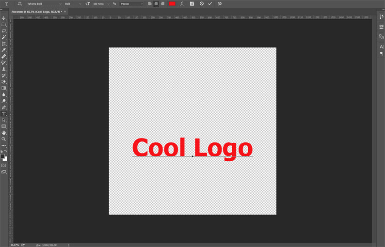
- Enter a name for the logo using the Type tool, select a font and color. You can find a selection of beautiful logo fonts here. Text can also be manipulated with layer styles, such as adding a stroke or shadow. This way you can get a beautiful inscription, but the main thing is not to overdo it with effects.
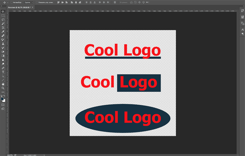
- You can try adding different shapes to the logo using appropriate tools such as ellipse, rectangle or line. This way you can make your logo more creative.
-
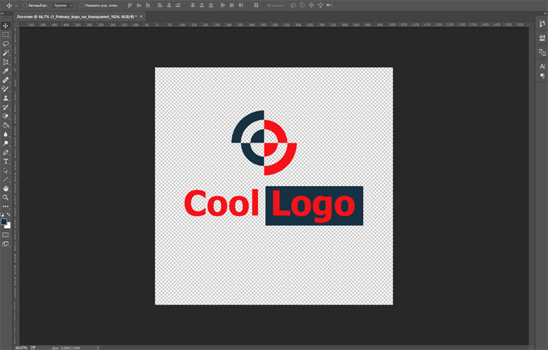
Add an icon. If you already have an icon for the logo, then you just need to add it to the canvas.
![Logo Maker Apps: An Overview of Free Services. Best logo maker software]()
-
Try to find a suitable color scheme for your logo. Read here how to choose a color. See below for examples of logos in different color schemes.
%5B!%5B%5D(https://inform.com.de/wp-content/uploads/2021/04/post-69783-607acc611df0d.png)
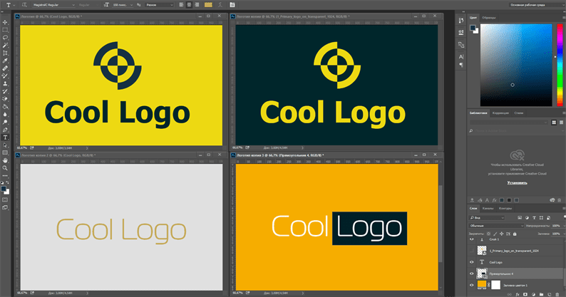
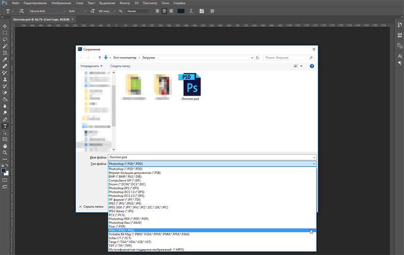
- Save the logo. It must be saved in PSD format (in order to edit it if necessary in the future) and PNG or JPG (for posting on a website in social networks, etc.).
This is the simplest way with a simple design. Experimenting with the toolkit of the program and the possibilities of new versions of “Photoshop”, you can create a more complex and original logo. This is how the text parameters are set on the side panel (writing style, font, color, slant, etc.), the desired image layer is changed, and any other logo elements are subject to creative modification.
Video tutorial on how to create a logo in Photoshop:
How to make a logo in Illustrator

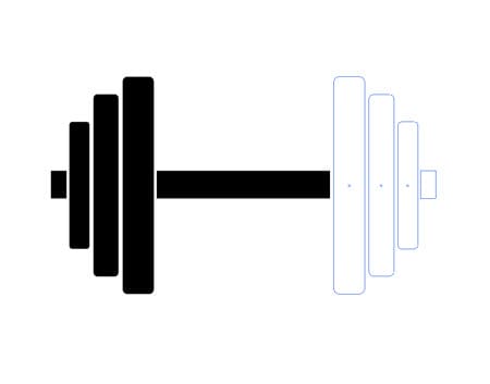
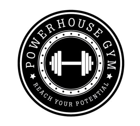
To explain how to work in Adobe Illustrator, we present a step-by-step guide on the example of creating a retro-style logo for a fictional fitness center. We will place the brand name and slogan on the logo along the perimeter of the circle, in the center of which we will draw the brand name. The logo is a simple image of a dumbbell so that potential clients immediately understand the direction of the firm.
Stages of work:
- Launch the software and create a new document.
- Draw a circle around the edge of the base and copy it by pressing Ctrl + C.
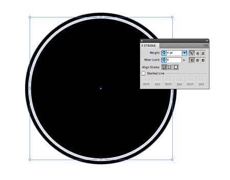
- Paste the copied element in front of the background, reducing its size (Alt + Shift).
- Choose a stroke color for the inner circle (turn off the fill, turn on the stroke and choose a shade, for example, white).
- Paste again a copy of the smaller circle (Control-F), and then another larger one and select the same shade with it. So the program will help to create the effect of a “thick” layer.
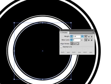
- Add circles to create a thin stroke (inner and outer).
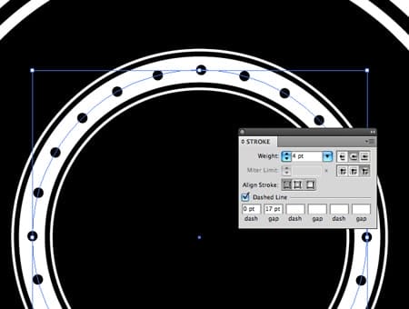
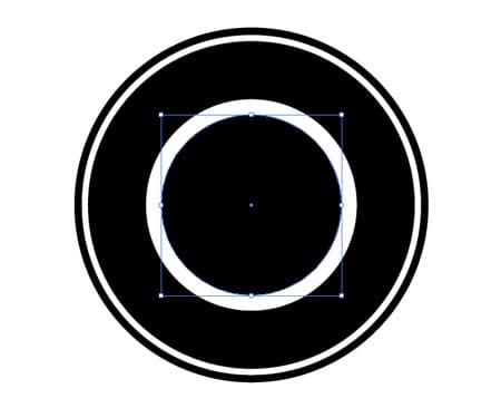
- We describe the circle between the inner and outer edges of the white circle, setting the desired parameters: thickness (17pt), cut joints, rounded corners, dash (0pt), dashed line, space (17pt).
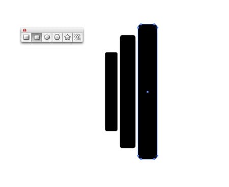
- Let's draw a set of discs for the logo using the Rectangle tool with rounded ends. Select the desired size, fill (favorite or corporate shade) and arrange the elements vertically, one after the other, symmetrically about the center.
- Let's represent the neck using a simple “Rectangle”.
- Copy and paste the circle again, giving it a transparent background by turning off the stroke and fill.
- Let's put the text on the picture: Tool “Text” in the menu – Text along the contour (TVK) – pressing the left mouse button on the circle.
- We print the name of the center.
- Set the spaces between the letters evenly: Text – Text along the outline – Options.
- Choosing the right font for the logo (for example, Boton).
- Center the text box with the Direct Selection Tool using a guideline.
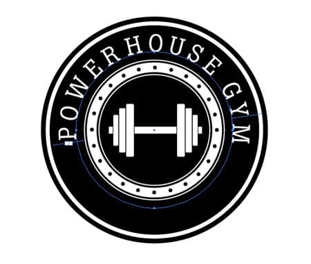
- In the same way, create an inscription of the slogan, which is mirrored from the name.
- Word alignment (TCE parameters – Align on contour – On descenders) with font selection.
- Separating the brand from the gym motto with painted stars.
The vector logo is ready. In this case, any element can be edited again, changing its dimensions and decorative properties.
How to make a logo in Corel

The program in Russian differs from those listed above in that mathematical formulas are used to describe vector images. Instead of graphic elements (pixels), other objects are used here: lines and shapes. At the same time, when deciding to create a picture, you need to set not only the thickness and tone of the lines, but also the coordinates of the object. A special advantage of icons created in CorelDRAW is that they can be edited (rotated, scaled) without compromising quality or clarity. You can also convert text content to a vector curve in CorelDRAW.
When creating a file, it is easy to work with the following elements:
- Text (invent new and edit existing fonts).
- Image (format raster to vector, create animations).
- It is possible to create a vector drawing from scratch, use tracing, geometric ornaments, drawing outlines and much more.
The main CorelDRAW tools that will allow you to create a logo:
- form (simple);
- free form (the same pencil for drawing arbitrary objects);
- a palette knife for pulling ready-made images;
- Bezier curve;
- standard objects: rectangle, circle, ellipse, etc.
- pen;
- text.
Simplifying the course of actions when working with this program, the simplest logo design looks like this:
- object image;
- converting it to curves;
- creative deformation with the Shape tool.
The same is repeated with text content. In this case, the dimension is not important, because scaling can be used at any time. Think over the design yourself, trying the various tools of the program on your own computer. All it takes is time, creativity, and great desire!
Video instruction on how to create a logo in CorelDRAW:
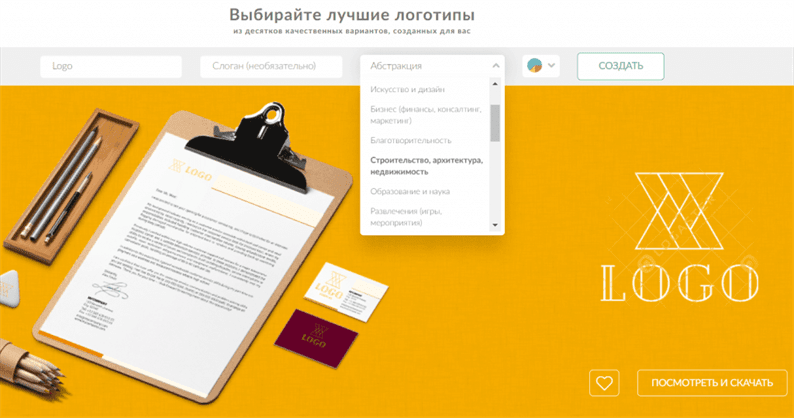
How to create a logo for a website in Logaster
For those who have never dealt with graphic programs and are not endowed with a creative streak, the best way to create a logo is to use special services on the Internet. Simple, straightforward and as accessible as possible. All you need to work is Internet access and a couple of free minutes. The logo generator allows you to create a beautiful brand name and download the finished copy in the desired format or in several at once. The service provides a free and paid set of functions.
Logaster advantages:
- there is no need for additional knowledge and training to work in graphic online logo editors;
- unlike other online services, www.logaster.ru has Cyrillic fonts;
- the process takes no more than 5 minutes;
- a huge selection of interesting templates is presented (the base includes high-quality modern fonts and icons);
- there is the possibility of creating a sketch for a professional designer.
At the same time, working on the resource for free, you can create a completely ready-to-use logo, and not just a sketch. You can also compare several different options, discuss them with the team and save for the future (copies are available to users of the service at any time). If you have any questions, then you will be assisted by the site support staff.
The actions in the constructor are simplified as much as possible. You need to do the following:
1 Enter the name of the company and select the type of activity of the organization or private specialist;
2 Choose an attractive layout;
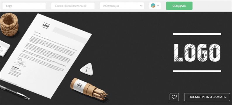
3 All the proposed logos are already ready for download, but if you want to change some individual elements in the selected logo: font, color, size, location, etc., click on “View and download” to save the logo in your account, and then “Edit”;
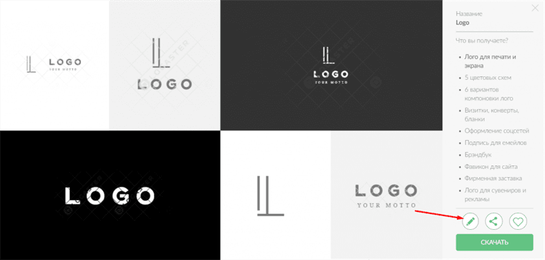
4 Now you can download the logo in the required format. Please note that the logo in good quality is available only after payment. But you can download the logo in small resolution for free. Read more about how to do this here.
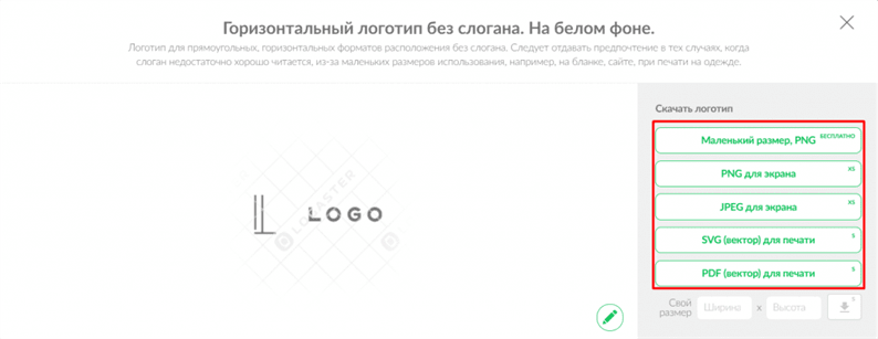
Products are presented in vector (SVG, PDF) and raster (PNG, JPEG) formats. This allows you to subsequently use the logo on any printed products (business cards or huge billboards) as well as on websites (PNG file with a transparent background).
Despite the simplicity and availability of the service, the result will delight everyone with its uniqueness, original design and speed of development. The logo maker also provides an opportunity to get inspired by ready-made variations from other users and site designers. Therefore, the creation of a logo will become a simple procedure, even for a person who is far from creativity.
We hope the proposed methods for developing a logo will help you translate your ideas into practice. Choose the best option and get to work.
2 Free Logo Design (https://www.freelogodesign.org)
Also an easy-to-use resource. Immediately on the main page, we enter the name of the company and the category of business and we get several variants of logos. After you have chosen the appropriate design, you can change some elements: choose the desired colors, location, add text, shapes, etc.
When registering, you must specify an email where the finished result will be sent to you. There is also an interesting blog on the site where you can learn about the history of some logos and branding, as well as find tips for developing your own design.
3 Free Logo Maker (https://logomakr.com)
Here you will have to try and show more of your imagination. To create a logo, you will have to choose the graphics and fonts yourself. All components have many settings, you can change any individual element. A huge number of libraries are available on the service, divided into categories, so you can easily find the elements you need.

4 LogotypeMaker (https://logotypemaker.com )
This resource allows you to create a logo by random selection with the possibility of further editing. A very handy feature with a separate replacement for graphics or text. Some symbols have the ability to change individual components in layers. The logo is available for download in three formats: jpg, png, svg.
5 Canva (https://www.canva.com/ru_ru/sozdat/logotip)
Canva is a multifunctional service for creating not only logos, but also banners, postcards, presentations, and more. The advantage is that the site already has ready-made free templates. You can choose the layout of the future logo from the existing ones, or you can create it yourself. If you don't know where to start, there are always hints on the site. It is possible to add your own images if you already know which elements you want to use in your design.
The animation function is available, which is now important for creating animated logos. True, you can use it for free only for 30 days. The paid package includes such functions as sorting by folders of different design options, creating sets of corporate identity, adding your own fonts to the layout, etc.
6 Hipster Logo Generator (http://www.hipsterlogogenerator.com)
A very easy to use resource. Logo creation is broken down into several steps. At each stage there is a hint on what to do. First you need to select a shape for the future logo, then the location of the font and some icons. Each object has the ability to change individual properties – fill, stroke, change color, transparency, etc.
7 Fotoump (https://fotoump.ru )
A large number of design tools are available in the online application: brushes, filters, shapes. I am especially pleased with the variety of fonts and stickers that will come in handy in creating a logo. When saving the result, it is proposed to select the format – jpg, png, json, as well as the quality of the source.
Even if you are not a designer and create a logo in such simple applications, there are some rules to keep in mind. We give you 6 tips to help you realize your idea in the best possible way:
- Simplicity – we talked about this at the beginning. You shouldn't use a lot of text and graphic objects in your design. Everything should look concise.
- Uniqueness – add some elements to the logo layout that are not repeated anywhere.
- Readability – the text of your logo should be clearly visible, no matter where it will be located: on a huge billboard or on a regular fountain pen.
- The combination of colors – it must be correct, not too provocative.
- Responsiveness – Create multiple design options. Consider all the options where the logo will be placed: advertising and printing products, business cards, banners, documents, etc.
- Emotional – Your brand name should evoke the right associations among consumers and be appropriate depending on the industry.
IPhone logo design apps
Are you too lazy to turn on your computer? Don't feel like paying for programs? Need to create a brand name quickly? Don't be eager to grasp a variety of tools? There is an exit. Mobile applications for creating logos. Especially for you, we have selected the best free apps for iPhones and Androids, in which creating a logo is a pleasure.
InstaLogo
Inspiration can come at any moment. Don't let him catch you off guard. With InstaLogo app you are always armed and ready to create unlimited logos. Turn your phone into a brand-rendering pipeline. InstaLogo's distinctive features are its intuitive interface, the ability to import files from the library, and full customization of logos with a choice of colors, shades, gradients and outlines. It is possible to save to Dropbox, Evernote and Box. And if you suddenly want to show off your creation to friends or colleagues, you can always send the final result by email or upload directly to Facebook. The app is free, but there are in-app purchases.

Logo design apps for Android
The number of users of the Android operating system is growing at an incredible pace every year. In 2018, 1.32 billion Android smartphones were sold and only 215 million iPhones were sold. Android app developers work tirelessly to make the best possible product and win the hearts of a billion-dollar audience. We also haven't forgotten about you, android fans, and how much you love to be creative. After careful selection, we settled on a candidate for the best logo rendering application. This free application developed specifically for the android operating system will be your best assistant in creating graphic signs and emblems.
Logo Maker Plus
There are millions of incredibly talented people living in our world. Brilliant actors, singers with an angelic voice, writers who can make people cry or laugh. If you still haven't found your path, then why not become a talented logo creator? Logo Maker Plus is a program that has no boundaries for creativity. A huge number of ready-made templates, many functions, fonts and colors for every taste. Tired of ready-made tools? Not a problem. Create your own unique templates, fonts, sizes and shapes. No more boring logos and brand names! The application is absolutely free, but there is one drawback: there is no Russification. But for the sake of such a product, you can improve your English.
In custody
We hope that this article helped you in choosing the best and optimal program with which you can create a logo that fully reflects the idea and originality of your company for free.
Sources used and useful links on the topic: https://logotip.online/blog/kak-sozdat-logotip/ https://infogra.ru/design/kakie-programmy-ispolzovat-dlya-sozdaniya-logotipov https: // turbologo .ru / blog / format-logo / https://logomak.com/ru/25-logo-creation-tips/ https://www.logowiks.com/create-a-logo/ https://zen.yandex .ru / media / id / 59d5fd2255876bfb75bf3068 / risuem-biznes-kak-sdelat-horoshii-logotip-pochti-bez-zatrat-5ac5eac8a936f460c0270c98 https://zen.yandexak.ru/media/ida-f5bed6c9df dlia-instagram-poshagovaia-instrukciia-5bee77c1f7b75300abbbcf96 https://www.logaster.ru/blog/logo-design-software/ https://zen.yandex.ru/media/id/5d176c6f1b553600ad16b238/7-prilojenii-dlia-sozdaniia-logotipa-obzor-besplatnyh-servisov-5d2708404735a600ac0af6d9 https://mediaaid.com/b553600ad16b238/7-prilojenii-dlia-sozdaniia-logotipa-obzor-besplatnyh-servisov-5d2708404735a600ac0af6d9 https://mediaaid.com/b553600ad16b238/blog/log-products/programs -logotipov / https://turbologo.ru/blog/programmi-dlya-sozdaniya-logo/
Post source: lastici.ru