“How to Lie with Statistics” by Darell Huff. How to lie with statistics
Content
Sampling bias
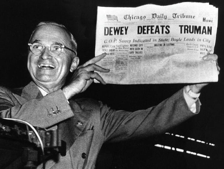
In 1948, during the presidential race in the United States on election night Truman (Democrats) versus Dewey (Republicans), the Chicago Tribune published perhaps its most famous headline, DEWEY DEFEATS TRUMAN (see photo). Immediately after the closure of the polling stations, the newspaper conducted a poll, calling a huge (enough for a sample) number of voters, and all heralds a resounding victory for Dewey. The photo shows Truman, the winner of the 48th election, laughing. What went wrong?
People were phoned by chance and in sufficient numbers, but in the 48th year the phone was available only to people of a certain income and was rarely found among people with little income. Thus, the polling method itself introduces an amendment to the distribution of votes. The sample did not take into account a fairly wide stratum of Truman's voters (as a rule, Democrats have a large share of votes among the poor), for whom the telephone, in turn, was not available. This selection is called biased.
Choosing the right average (Well-chosen average)
Imagine a company in which a manager receives 25 thousand, his deputy 7.6 thousand, top managers 5.5 thousand, middle managers 3.5 thousand, junior managers 2.5 thousand, and ordinary workers 1, 4 thousand (abstract pounds) per month.
And our task is to present information about the company in a positive light. We can write the average salary in the company is X, but what does average mean? Consider the possible options (see the diagram below): The arithmetic mean of some finite set X = {xi} is a number m equal to mean (X) from the equation: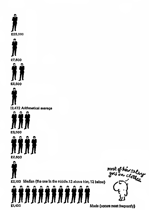

This is the most useless piece of information from the employee's point of view – 3.472 average wages, but what makes such a high figure? Due to the high salaries of the management, which creates the illusion that the employee will receive the same amount. From the point of view of the employee, this value is not particularly informative.
Of course, folk art did not bypass this feature of the “average size” in the form of an arithmetic mean
Officials eat meat, I eat cabbage. On average, we eat cabbage rolls.
The median of some distribution P (X) (X = {xi}) is such a value m that it satisfies the following equation: Simply put, half of the workers get more than this value, and half less – exactly the middle of the distribution! These statistics are quite informative for the employees of the company, as they allow to determine how the employee's salary relates to the majority of employees. The mode of a finite set X = {xi} is the number m that occurs most often in X. In this case, fashion may be the most informative for a person who is going to start working in a given company.
Thus, depending on the situation, the average value can be understood as any of the above values (in principle and not only of them). Therefore, it is fundamentally important to understand how this average is calculated.
And 10 more unsuccessful experiments that we have not written about
Let's put an ordinary newspaper in sulfuric acid, and TV Park magazine in distilled water! Feel the difference? Nothing happened to the magazine – the paper is like new! Our research reports Doake's Toothpaste is 23% more effective than the competition, thanks to Dr Cornish's Tooth Powder! (Which probably contained β-carotene and the secret formula of the forest – author's note.) You might be surprised, but the research was actually carried out and even released a technical report. And the experiment did show that toothpaste is 23% more effective than the competition (whatever that means). But is this just the whole story?
In reality, the sample for the experiment was only a dozen people (according to Darrell Huff and the book already mentioned). This is exactly the sample you need to get any results! Let's say we flip a coin five times. What is the likelihood that it will land heads all five times? (1/2) 5 = 1/32. Just one thirty-two, it can't just be a coincidence that all five heads come up, can it? Now let's imagine that we repeat this experiment 50 times. At least one of these attempts will be successful. We will write about it in the report, and all other experiments will not go anywhere. Thus, we will receive exclusively random data that fits perfectly into our task.
Playing with the scale
Suppose tomorrow you need to show at a meeting that we have caught up with competitors, but the numbers do not converge a little, what should we do? Let's move the scale a little! Even the renowned New York Times, renowned for their quality data work, has released a completely confusing graph like this (note the jump from 800k to 1.5m in the center of the scale). (example from Howard Wainer. The American Statistician, 1984.)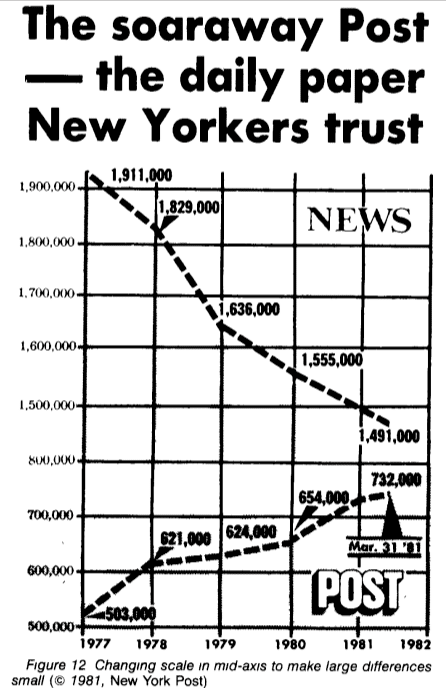
We choose 100%
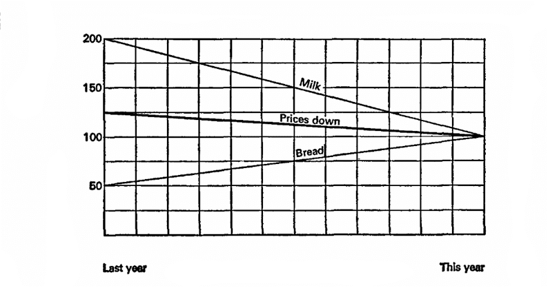
Let's imagine that last year milk cost 10 kopecks per liter and bread was 10 kopecks per loaf. This year milk has dropped in price by 5 kopecks, while bread has grown by 20. Attention to the question, what do we want to prove?
Let's imagine that last year is 100%, the basis for calculations. Then milk fell in price by 50%, and bread increased by 200%, an average of 125%, which means that prices in general increased by 25%. Let's try again, let the current year be 100%, which means that milk prices were 200% last year, and bread 50%. This means that last year prices were on average 25% higher!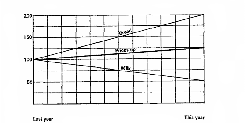
Collect data that will make your conclusions even more biased
The first step in collecting statistics is to determine what you want to analyze. Statisticians call information at this stage the population. You then define a subclass of data that, when analyzed, should represent the entire population as a whole. The larger and more accurate the sample, the more accurate the research results will be.
Of course, there are different ways to spoil a statistical sample by accident or intentionally:
- Selection bias. This error occurs when the people taking part in the study identify themselves as a group that does not represent the entire population.
- Random sampling. Occurs when readily available information is analyzed rather than trying to collect representative data. For example, a news channel might conduct a political survey among its viewers. Without asking people who watch other channels (or do not watch TV at all), it cannot be said that the results of such a study will reflect reality.
- Refusal of respondents to participate. Such a statistical error occurs when some people do not answer the questions asked in a statistical study. This leads to incorrect display of results. For example, if a study asks the question, “Have you ever cheated on your spouse?” As a result, it will seem that cheating is rare.
- Free access polls. Anyone can take part in such surveys. Often it is not even checked how many times the same person answered questions. An example is various surveys on the Internet. It is very interesting to pass them, but they cannot be considered objective.
The beauty of selection bias is that someone, somewhere, is likely to conduct an unscientific survey that will support whatever theory you have. So just search the web for the poll you want, or create your own.
Choose Results That Support Your Ideas
Since statistics use numbers, it seems to us that they convincingly prove any idea. Statistics relies on complex mathematical calculations that, if mishandled, can lead to completely opposite results.
To demonstrate the flaws in data analysis, English mathematician Francis Anscombe created the Anscombe quartet. It consists of four sets of numerical data that look completely different on the graphs.
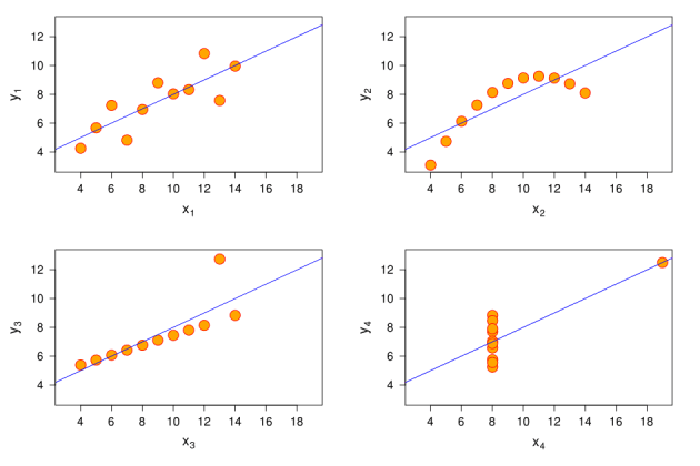
Figure X1 is a standard scatter plot; X2 is a curve that first rises up and then falls down; X3 – a line that rises slightly upward, with one overshoot on the Y axis; X4 – data on the X-axis, except for one outlier located high on both axes.
For each of the graphs, the following statements are true:
- The mean of x for each dataset is 9.
- The mean of y for each dataset is 7.5.
- The variance (scatter) of the x variable is 11, and the y variable is 4.12.
- The correlation between variables x and y for each dataset is 0.816.
If we saw this data only in the form of text, we would think that the situations are completely the same, although the graphs refute this.
Therefore, Enscombe suggested that you first visualize the data, and only then draw conclusions. Of course, if you want to mislead someone, skip this step.
Create graphs that highlight your desired results
Most people don't have time to do their own statistical analysis. They expect you to show them graphs summarizing all of your research. Well-designed charts should reflect ideas that fit reality. But they can also highlight the data you want to show.
Omit the names of some parameters, slightly change the scale on the coordinate axis, do not explain the context. So you can convince everyone that you are right.
By all means, hide sources
If you openly cite your sources, it's easy for people to verify your findings. Of course, if you are trying to get everyone around your finger, never tell how you came to your conclusions.
Usually, in articles and studies, references to sources are always indicated. At the same time, original works may not be provided in full. The main thing is that the source answers the following questions:
- How was the data collected? Were people interviewed by phone? Or was it stopped on the street? Or was it a Twitter poll? The method of collecting information can indicate certain selection errors.
- When did they meet? Research quickly becomes outdated and trends change, so the timing of information gathering influences conclusions.
- Who collected them? There is little credibility in the tobacco company's research on the safety of smoking.
- Who was interviewed? This is especially important for public opinion polls. If a politician conducts a survey among those who sympathize with him, the results will not reflect the opinion of the entire population.
How to Lie Using Statistics – Part 2
We continue to analyze how you can mislead people by using statistics incorrectly. Previous post
Medium selection
You can often hear the word “average” in news and advertisements. But what is mean? There is arithmetic mean, geometric mean, harmonic mean and the list goes on! And inappropriate (accidentally or deliberately) choice of the mean can significantly distort the results.
Let's consider an example. Suppose we have three people: grandmother Elena Anatolyevna with a pension of 8,000, system administrator Vasya with a salary of 40,000 and millionaire Pavel Umnov, who earns exactly one million a month
If we simply calculate the arithmetic mean by adding their salaries and dividing by 3, we get that it is equal to 350 thousand rubles! It remains to please grandmother with this news
On a logarithmic scale, these values don't even look too far apart. Red line – arithmetic mean
For such cases, a mean such as the median is better suited. This is the value that divides all of our data into two equal parts (in terms of quantity). The median value for this example would be the salary of the system administrator Vasya – 40,000. Before and after her there is the same number of people (one at a time). Then we could call Vasya a person with an average salary, everyone who receives less than Vasya – with a small income, more – rich.
However, with the help of the median, on the contrary, it would be possible to hide very prominent (up or down) values
Folding non-folding
Think of the school's five-point grading system. Imagine that a seventh grader Danil wrote a dictation for 5, and his classmate Leonardo decided to write it from right to left and received a two. We divide 5 by 2 and we get that Danil wrote the dictation 2.5 times better! Right?
Wrong. Scores are a contrived nominal variable that numerically expresses verbal grades of excellent, good, and so on. Is “unsatisfactory” exactly 2.5 times worse than “excellent”?
Thus, it is not mathematically meaningful to calculate average scores for grades or for any tests.
Biased sampling
According to Internet voting data, 100% of people use the Internet
Before any statistics, you can lie if you collect the data incorrectly. A classic example is the 1948 US presidential race: Dewey vs. Truman. The Chicago Tribune conducted a poll immediately after polling stations closed, calling a huge number of people. And according to the results predicting a resounding success, Dewey published a newspaper with the headline ” DEWEY Wins Truman .” The photo shows a laughing Truman, winner of the 1948 elections, with this very newspaper in his hands
Something went wrong? The newspaper phoned a sufficient number of voters for the sample, and indeed random ones. Only the approach itself was wrong – the telephone at that time was not available to the poor population, the bulk of which was Truman's support.
Another example is the salaries of graduates promised by universities. In the United States, it even went to the courts – graduates argued that the data on salaries were artificially high. But the point is completely different: it's just that only people who are satisfied with them share data on their earnings with the university.
“Visual” visualization
There are a thousand and one ways to embellish the data. For example, visualize them visually. It can help reading boring charts, and if done with a bit of trickery, then it is more profitable to present them.
Here is a graph of US beer consumption in million barrels and Schlitz's share. He's really impressive!
But let's put this graph in a more rigorous form: display the data with dots and start the y-axis from zero:
Doesn't seem so impressive anymore. When plotting points on the graph in the form of barrels, people visually perceive not the tops of the barrels, but their volume. And when the side of the barrel is enlarged by 2 times, the volume increases by 8 times! On this scale, the y-axis starting at 100 helps.
Here's another example. Wonderful infographics that show how much money is spent on fighting diseases and deaths from them
The idea is great. However, take a closer look at the numbers. The price with an orange circle is about 2 times less than with a pink one. But the pink circle is 4 times bigger!
The authors preferred to make the radius of the circle dependent on the price. But we visually perceive not the radius at all, but the area of the figure! And the formula for the area of a circle depends on the radius quadratically
This infographic can be made even better by placing the same diseases on the same line. This is what the revised version looks like:
Visualization is not only more believable, but also clearly conveys the idea: some diseases are not as dangerous as money is spent on them, and the fight against others is underfunded.
An example of high-quality visualization
The graph shows the size of Napoleon's army. The extreme right point is Moscow, from where the retreat begins, shown by a black stripe. The time and temperature graph is also linked to the retreat schedule. Very clear!
About the book “How to Lie Using Statistics” by Darell Huff
In this world famous book, Darell Huff talks about the various ways statistics are misused to deceive and manipulate audiences. Every day they try to influence you in order to encourage you to buy some “necessary” product or to choose the “right” candidate: “Thanks to the” Clean Teeth “paste, the formation of caries is reduced by 23%!”; “N policy is supported by 85% of citizens” … How to understand how reliable certain data are? How are calculations? What is taken into account and what remains behind the scenes? The author reveals the secret tools of statisticians and equips the reader with knowledge that will help to understand all the intricacies of this science and will not allow confusion.
annotation
In this world famous book, Darell Huff discusses the various ways statistics are misused to deceive and manipulate audiences. Every day they try to influence you in order to encourage you to buy some “necessary” product or to choose the “right” candidate: “Thanks to the” Clean Teeth “paste, the formation of caries is reduced by 23%!”; “N policy is supported by 85% of citizens” … How to understand how reliable this or that data is? How is the calculation done? What is taken into account and what is left behind the scenes? The author reveals the secret tools of statisticians and equips the reader with knowledge that will help to understand all the intricacies of this science and will not allow you to be misled.
Sources used and useful links on the topic: https://habr.com/ru/post/217545/ https://Lifehacker.ru/4-sposoba-lgat-pri-pomoshhi-statistiki/ https://pikabu.ru/ story / kaklgat_s_pomoshchyu_statistiki_chast_2_6113007 https://lifeinbooks.net/chto-pochitat/kak-lgat-pri-pomoshhi-statistiki-darell-haff/ https://coollib.net/b/331961-kat-plgat-
Post source: lastici.ru